Market Dashboard features you can use to create revenue projections to analyze Airbnb pricing
- Listings and Comp sets to analyze the performance of your competitor properties.
- Market Summary to understand the KPIs of your comp sets.
- Length of stay by stay date to understand the typical number of days guests might stay for any given date in the past within the time frame selected.
- Length of stay vs. Booking Window to compare the market booking window to the length of stay for booking nights.
- Amenities section to understand the common amenities in that area.
Investing in an Airbnb property is a great source of passive income. In recent years Airbnb has made vacation rentals more accessible; Airbnb alone lists 73% of global short-term rental properties, with most properties in the United States. Airbnb revenue projections for 2023 show positive signs of growth.
Since the pandemic, more and more people have started getting into the Airbnb business in search of passive income and building toward financial freedom. Airbnb supply grew 30% across the top 25 countries last year. Social media is filled with hosts sharing their road to financial freedom in the Airbnb industry – one such is the recent Short-Term Rental Secrets podcast – From 0 to Over 50 Properties in 18 months, with Kyle and Allie Fugatt.
While the financial freedom of owning an Airbnb is publicly understood, it is essential to understand your financial forecast before you invest in a property. Airbnb revenue projections help you understand how much your property or the property you manage will potentially make in terms of profits and revenue in general. Understanding this will help in Airbnb revenue optimization in the later stages.
With Airbnb revenue projections, property managers and hosts can
- Understand the revenue potential of the property and the market
- Make informed investment decisions
- Plan your investment with data-supported decisions
When you have done your market research for your revenue projections, you will be able to understand the kind of properties that are getting booked the most, what amenities they have, and the booking patterns of the market. You can also understand the financial investment you must put into your vacation property.
Airbnb Performance Dashboard vs. PriceLabs Market Dashboard
| Feature | Airbnb Performance Dashboard | PriceLabs Market Dashboards |
| Availability | This will be available automatically if you manage more than 6 listings. If you manage 2-5 listings, you must manually opt-in for the tool in the Airbnb professional hosting tools. | Market Dashboard is available for everyone, irrespective of the number of listings you manage or own. |
| Market Data | Limited to the user’s own Airbnb performance data | PriceLabs Market Dashboard provides real-time data from Airbnb, Vrbo, |
Overall, while Airbnb Performance Dashboard provides basic performance metrics for only Airbnb listings, PriceLabs Market Dashboards offers more detailed market insights and customizable pricing recommendations for multiple vacation rental platforms, making it a more comprehensive solution for Airbnb managers and hosts.
While there are advantages of Airbnb smart pricing, the disadvantages of Airbnb smart pricing easily outweigh them when compared with PriceLabs Dynamic Pricing. PriceLabs is a revenue management solution for the short-term rental and hospitality industry, serving customers such as individual hosts, vacation rental managers, and hoteliers. In other words, it is one of the best Airbnb pricing tools available.
How can you create revenue projections using PriceLabs Market Dashboards to analyze Airbnb pricing?
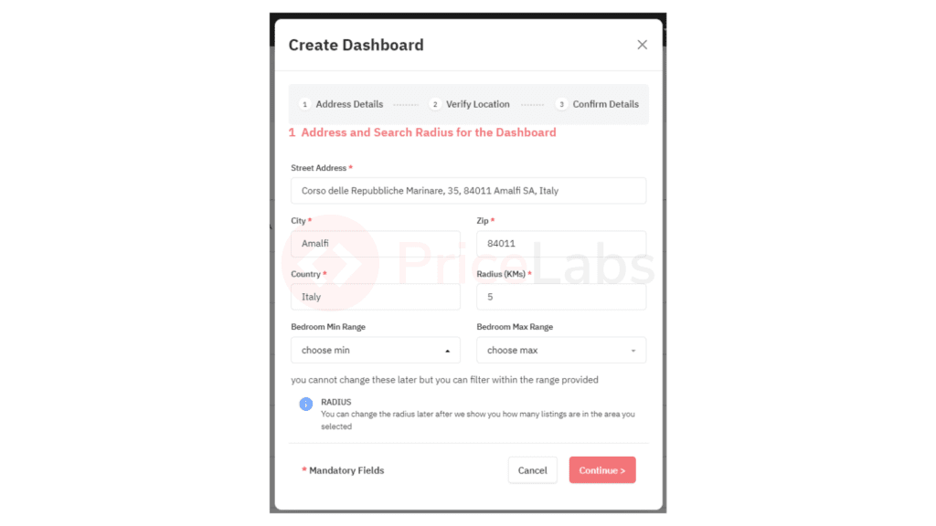
For explanation purposes, we will create a Market Dashboard for Amalfi, Italy, in this article.
Step 1: Create a dashboard
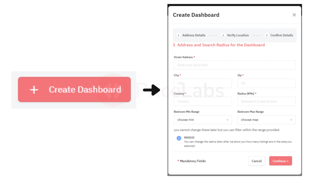
Fill in the details of your Airbnb property if you know which one you plan to invest in. Or, if you are still trying to understand the market, pick a central point of the location you want to invest in and add the address here.
We’re picking the city’s post office address-Ufficio Postale Poste Italiane for this dashboard.
Fill in the fields as required, set the radius to cover your desired area, and click continue. You can always update the bedroom count within the Market Dashboard as well.
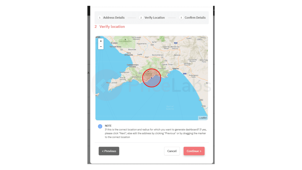
Next, verify the location and check if this is the locality you want to analyze. You can drag the circled area to adjust your selected location if necessary. Once you’ve verified the location, click continue.
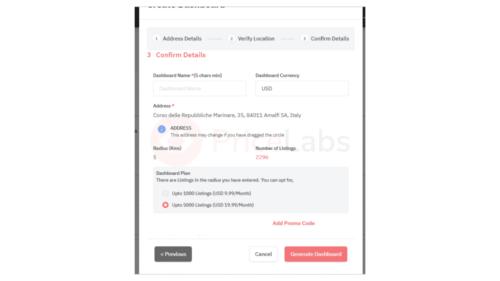
Verify the details, select your dashboard size, and click “Generate Dashboard” to create the dashboard. The data will take five to fifteen minutes to be generated; you will get a notification in your inbox when your Dashboard is ready.
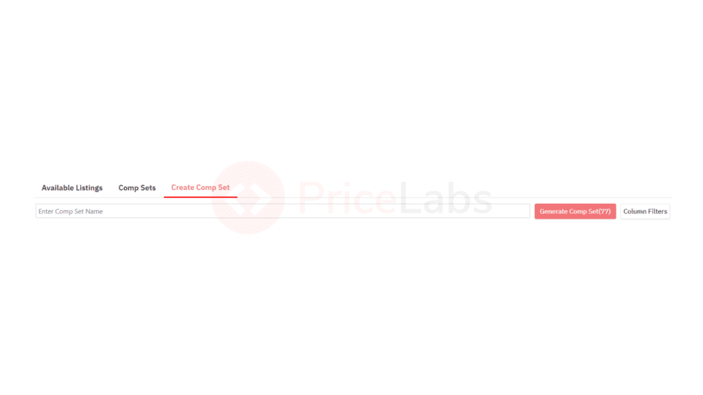
Once in the Market Dashboard, scroll down to the ‘Listings & Comp Sets’ section. Using the filters, select your competitors in the market and analyze their listings.
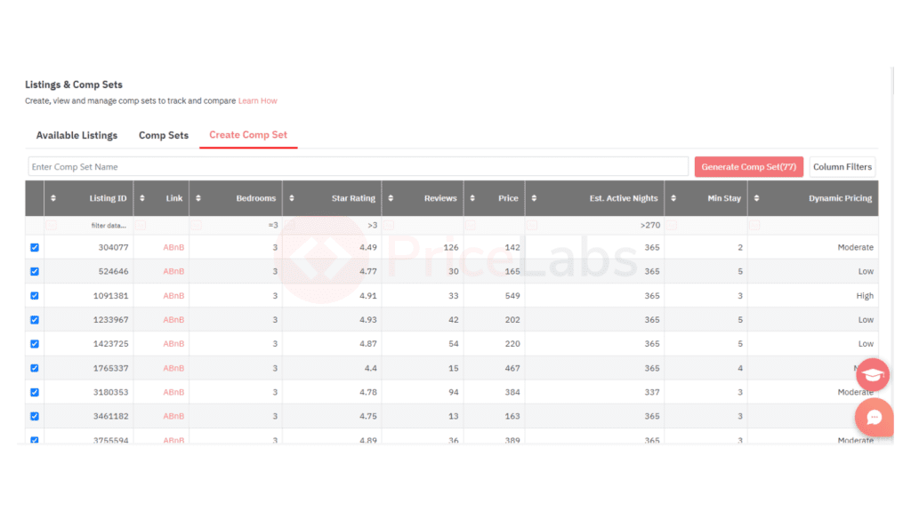
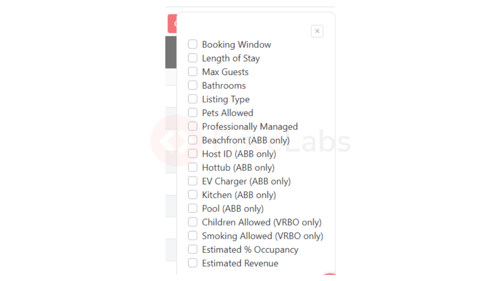
Click on “Column Filters” to see a list of additional features to add to the comp set table; you can use these filters to pinpoint the properties most comparable to yours or those generating higher revenue to help understand how your competitors are performing in the market. Use the tick boxes along the left side of the grid to select the listings to add to your comp set, give the comp set a name, and click ‘Create Comp Set’ to save your work.
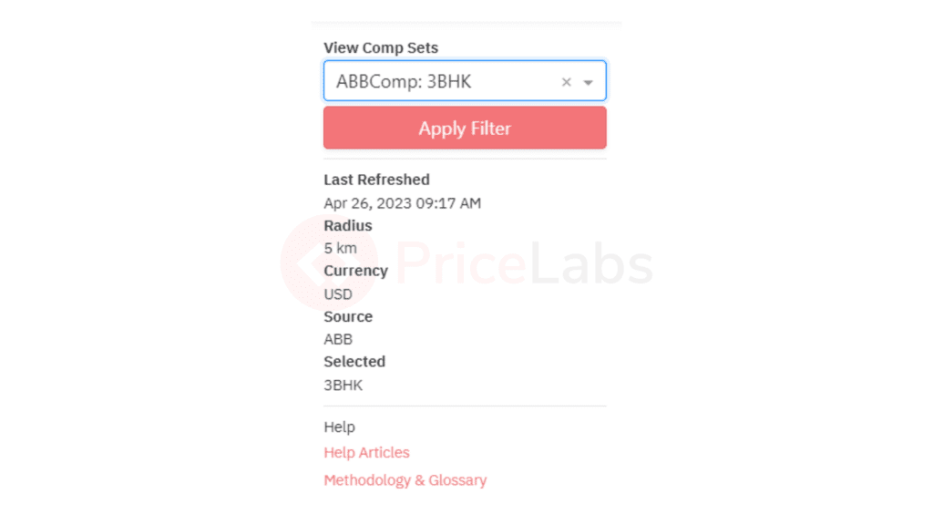
On the top left corner of the Market Dashboard page, you will see a filter to ‘View Comp Set.’ Select the comp set you want to view, and the entire Market Dashboard will show data for that particular comp set. I have clicked on the comp set we created above in the filter here.
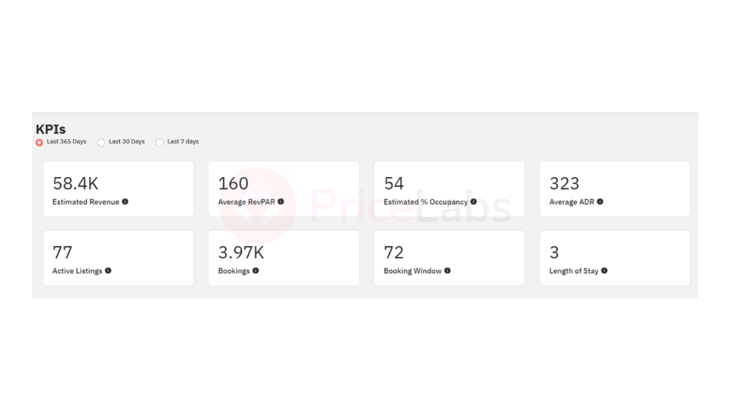
You will find the KPIs section at the top of the dashboard. This section provides an overview of eight key performance indicators (KPIs) that compare data from the past seven, 30, or 365 days to the previous period of the same length. It serves as a quick and convenient way to observe market trends in the area covered by your dashboard or comp set, including potential seasonal or pandemic-related shifts in guests’ booking behavior.
Here you can also see the estimated revenue in that area for properties in the selected comp-set. This is an estimation because PriceLabs does not have access to the expenses that the property might incur.
This shows KPIs for your property in the time frame you want to analyze. Now, go below to Market Summary to check the historical KPIs for the comp set we have set above. These charts show the average revenue, occupancy, booking window, and length of stay for listings that had bookings in that particular month for the current month and the previous 15 months. For example, if you are in a long-term market, then the revenue for that stay would count toward the month with the check-in date.
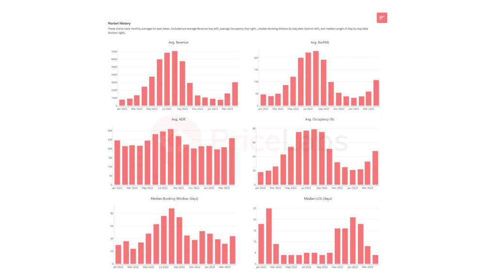
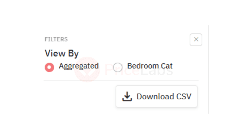
These charts provide you with trends averaged by month for the entire market or broken down by bedroom category. You can choose the view by clicking on the menu in the top right corner (as shown below)
This chart lets you understand the average revenue properties in that area in the previous year. You can use this to benchmark revenue for the next year.
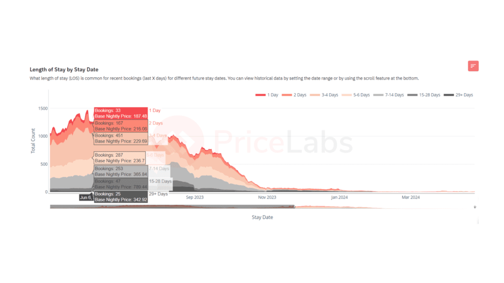
Next, it is essential to understand the kind of bookings you might get. We advise you to look at the Length of Stay by Stay Date graph. This shows the typical number of days guests might stay for any given date in the past within the time frame selected.
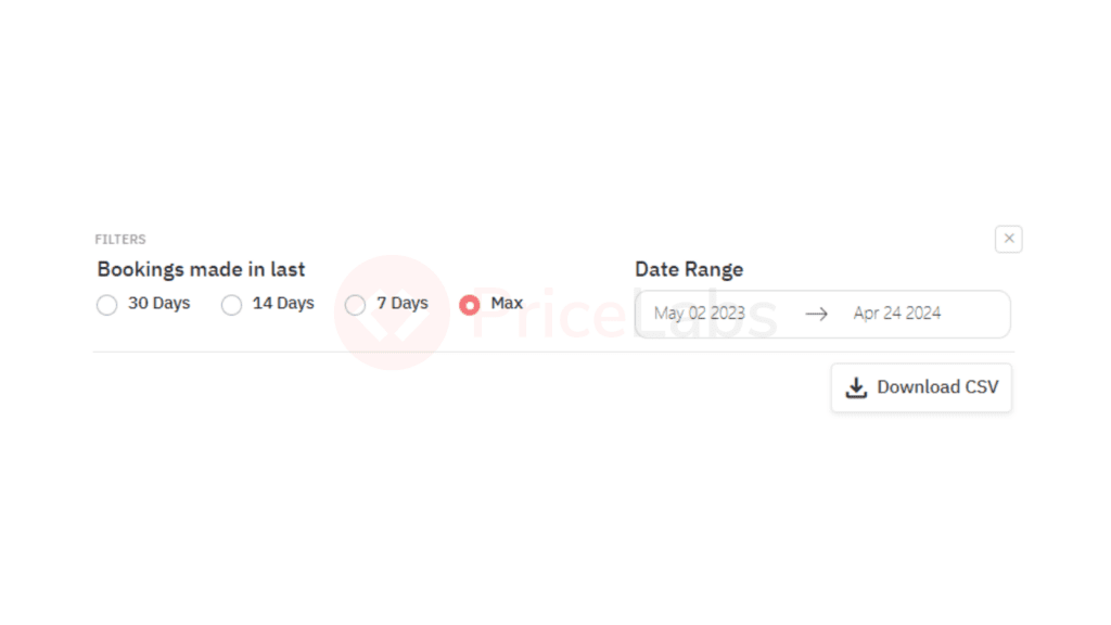
Here, it is better to choose Max to have the most data to make informed decisions. You can hover your mouse over the graph to see details on stay length and ADR for specific dates.
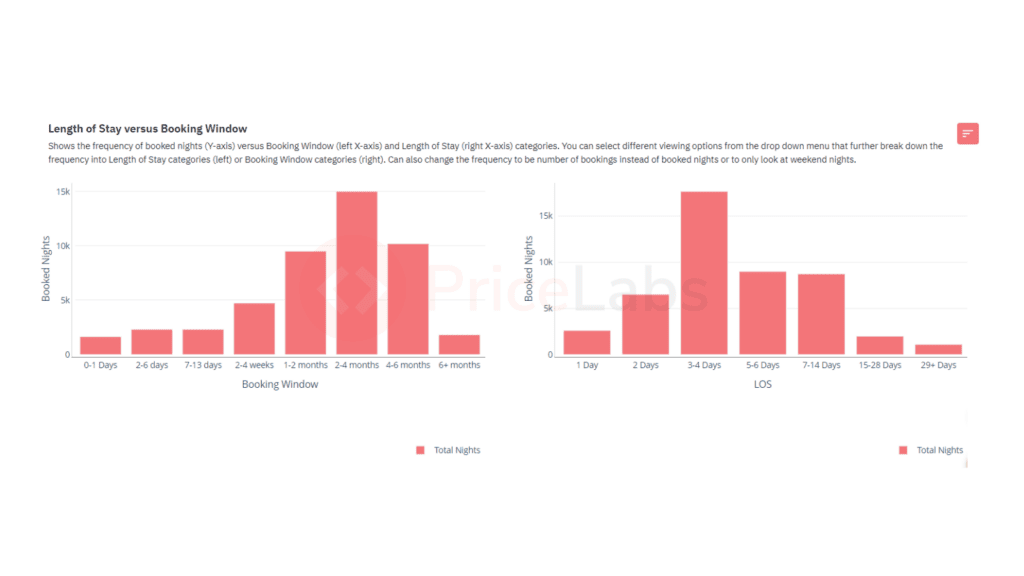
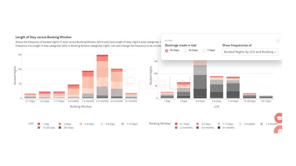
Let’s dive deeper and compare the market booking window to the length of stay for booking nights. This is what you get with our LOS vs Booking Window charts. In the graph below, the left shows the number of occupied nights for each booking window. The right side shows the number of nights booked for each length of stay category.
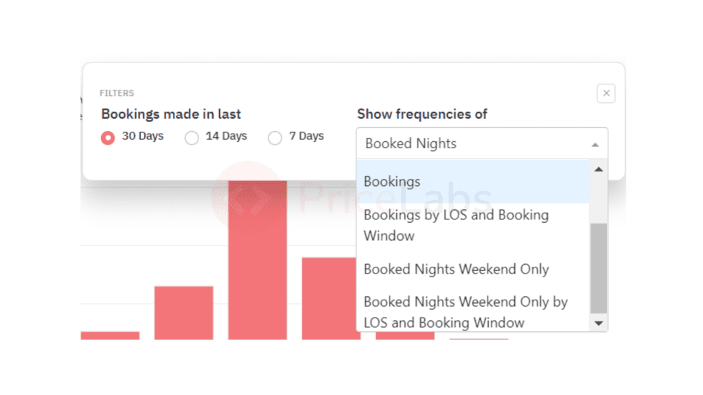
If you click on the menu on the right, you will get multiple options:
- Booked Nights
- Booked Nights by LOS and Booking Window
- Bookings
- Bookings by LOS and Booking Window
- Booked Nights Weekend Only
- Booked Nights Weekend Only by LOS and Booking Window
This chart will help you understand the kind of bookings made recently in this market or for your comp set and help you craft your minimum stay strategy accordingly. It will be hidden if you click on a category in the legend below the charts.
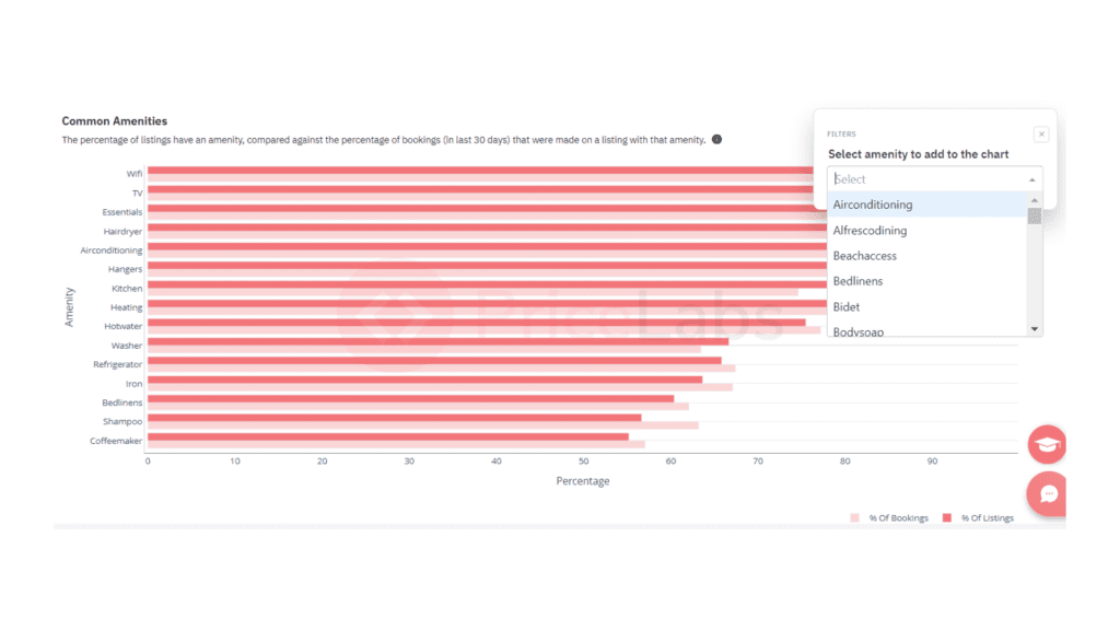
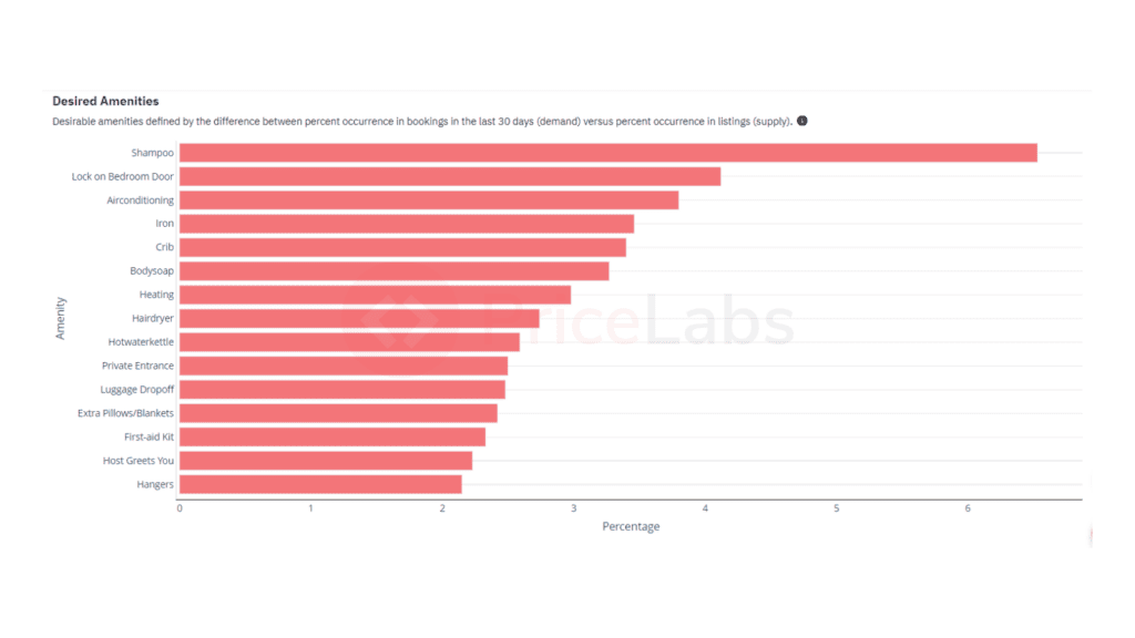
To understand widely available amenities or those not as common in your market or comp set, head to the Amenities section of your Market Dashboard. Here two charts compare the percentages of listings with an amenity with the percentage of bookings with that particular amenity.
The Common Amenities chart lists the amenities by the percentage of listings with them.
The Desired Amenities chart lists amenities by those with the largest difference between the percentage of listings with that amenity and the percentage of bookings made at listings with these amenities.
Step 3: Create your revenue projection presentation to analyze Airbnb pricing
Download the entire Market Dashboard as a PDF along with your company’s logo in the PDF if you have added an image in your account settings. If you want to add more information for your client, dissect the PDF, create your projection on easy-to-use software like Canva, and easily present and wow your clients.
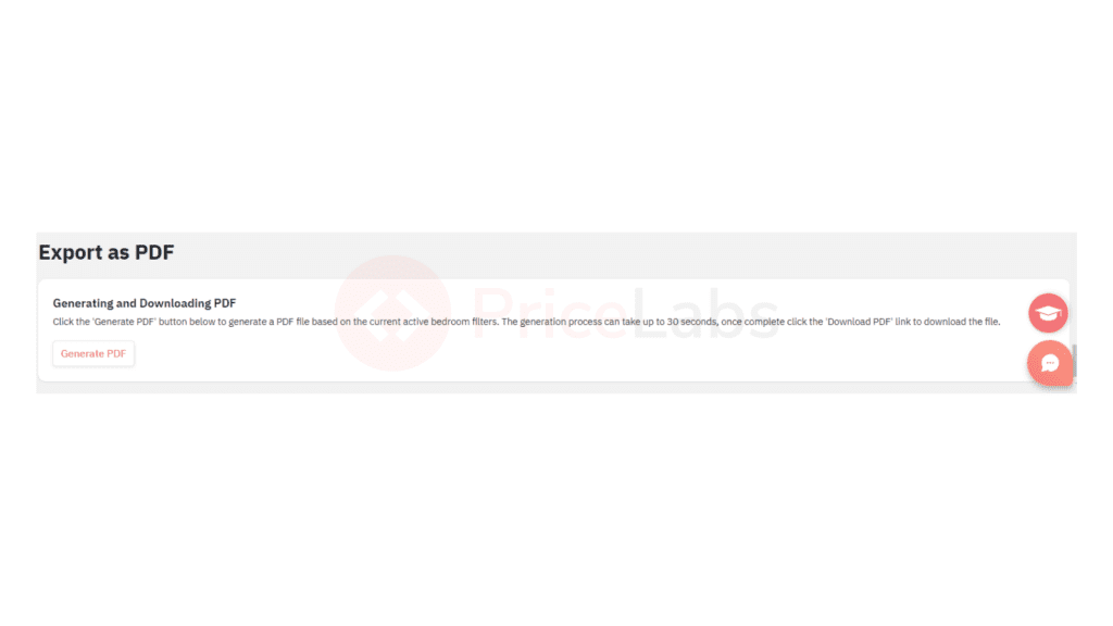
NOTE: The report is downloaded with data for the active bedroom filters in the dashboard.
Look at a sample report for the dashboard we created for this article. Click here.